Visual Design of Nostr clients
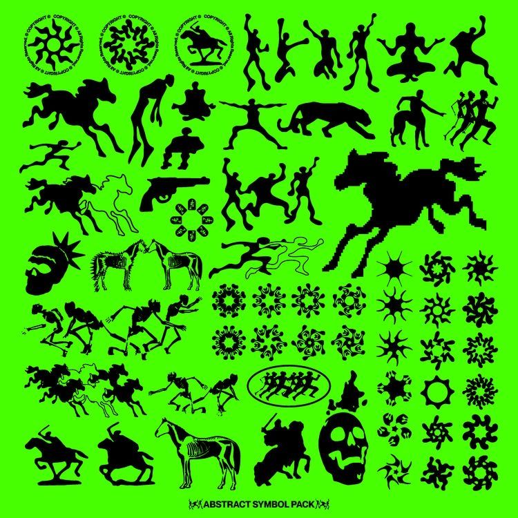
Developers have already created numerous Nostr clients for everything you can possibly do there. Other clients are in development now, and some exist just as ideas in developers’ minds.
I want to talk about design. I’m not here to judge anything, I understand that many developers only build clients for functionality or experiments, and it’s not like visual style is a huge problem here. This article is for developers who might be concerned about not having any idea what their client should look like, so I’m here to provide some ideas. I hope you’ll find some of them useful.
I’m not a designer, so all I say here is just a noname’s opinion you can ignore.
Let’s begin.
First thing I want to say out loud — don’t be shy. Get the weirdest design idea you have on your mind. Why do you like it? Is it unique? Is it intuitive? Is it memorable? Do you think it might scare away possible users?
Let’s be honest, the internet is full of lackluster websites and apps. I don’t really get why — do they just play safe or do they think their unique app doesn’t need a memorable style?
Newspaper
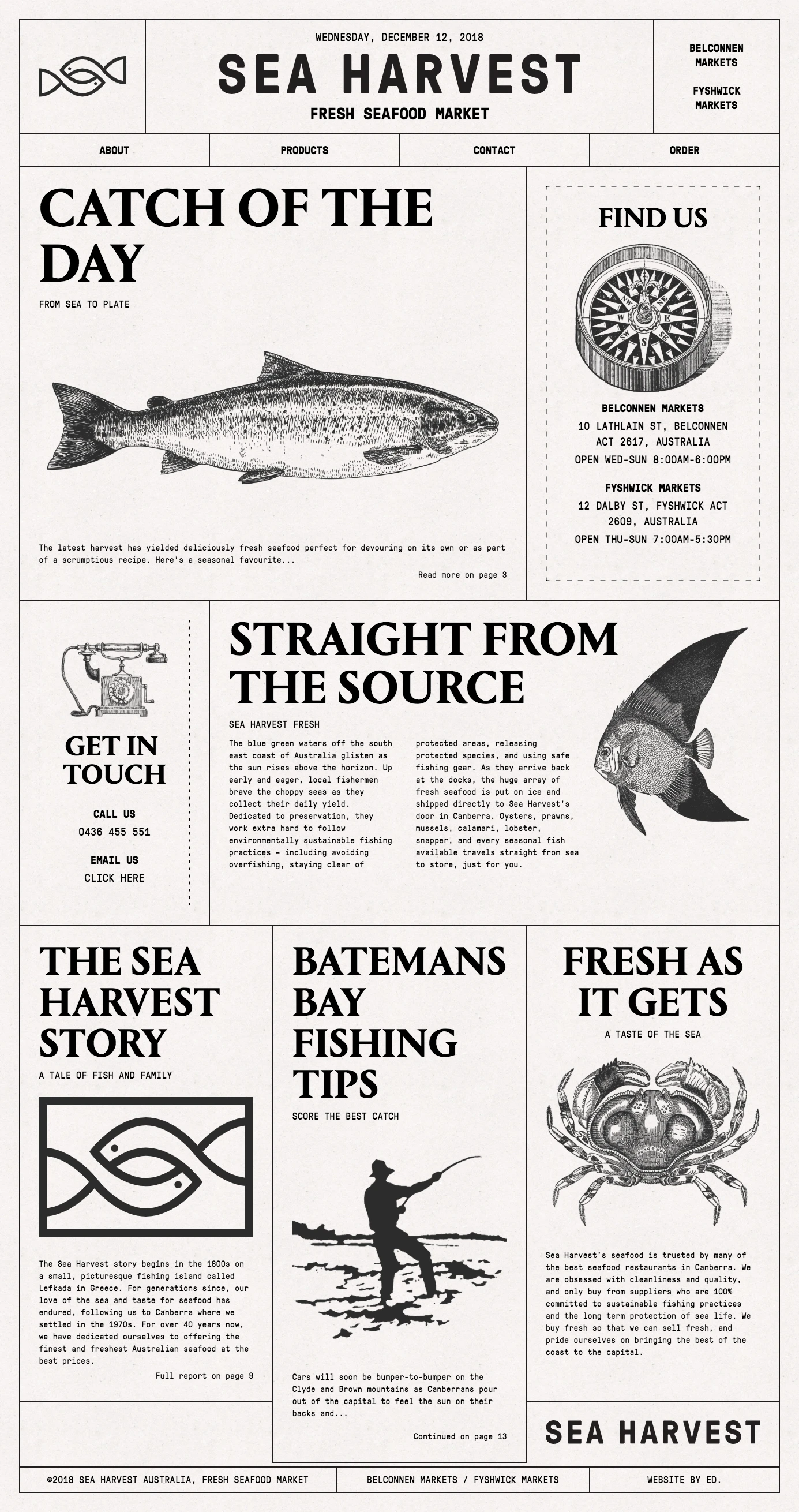
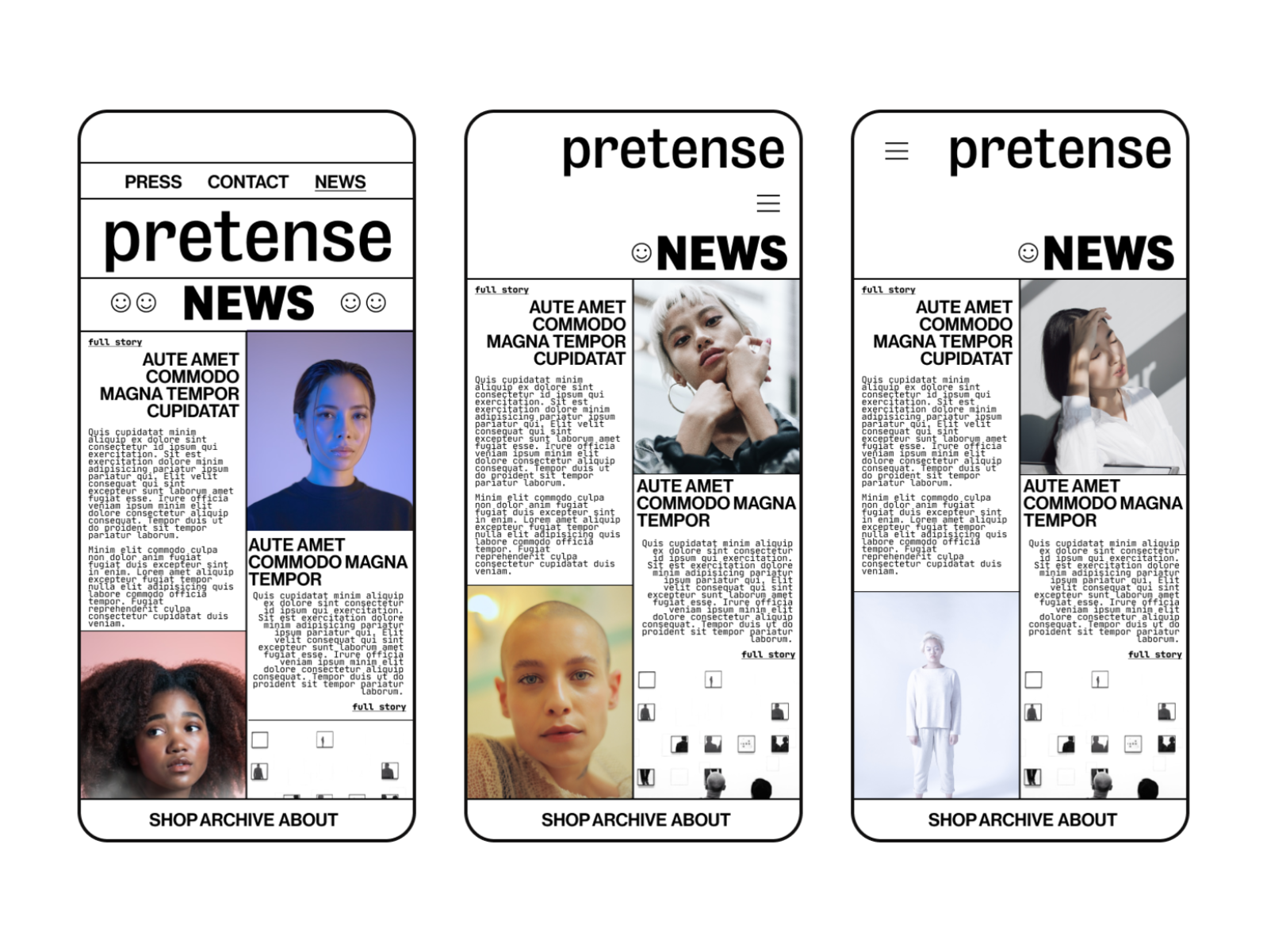
It’s cozy, it’s retro, it’s safe and it’s hard to make a mistake. Sharp bordered rectangles and no bright colors make it easy to follow the overall idea. Posts easily become blocks — I mean, that’s kinda the origin of modern websites. This design is difficult to imagine with silly memes, so yeah, I believe meaningful discussions would be the best fit.
Monochrome Minimalism


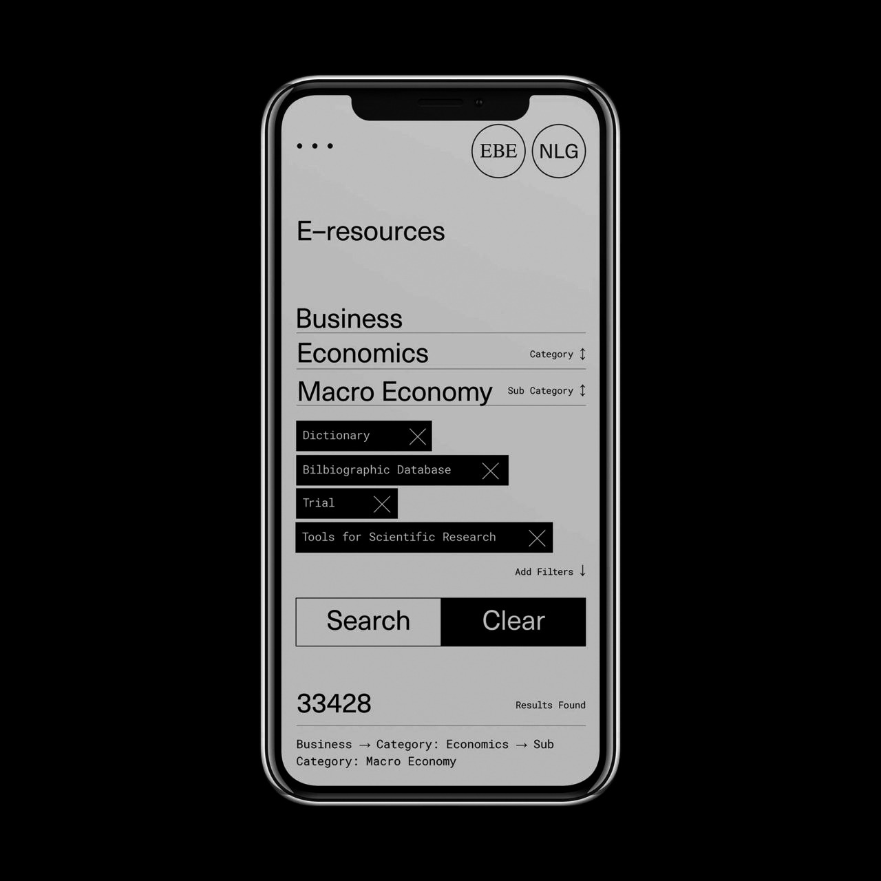
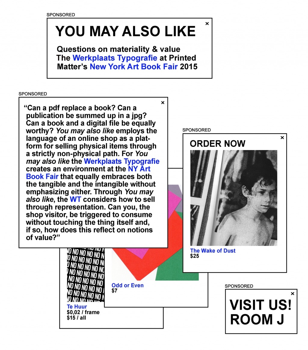
It’s ridiculously simple and raw. Primitive shapes, bold black borders and white background; some unusual font choices here and there. Is that Arial? This approach might look like lack of design at first glance, like it got stuck in the 90s — right before colors became so common you couldn’t find a website without a 3-frame green-pink-yellow gif at the background. But the longer you look at it, the more thoughtful design choices you notice. It doesn’t lack any design, the simplicity is the core design here. It’s simple because of colorful websites everyone is used to.
Pseudo terminal
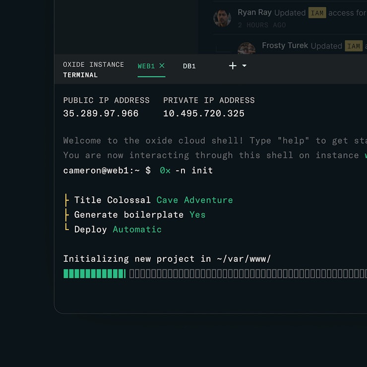


There is something weirdly attractive in a design that looks like a terminal with all those tildes and braces and other symbols which help you to get the meaning without pictures. The pseudo terminal is weird and specific and definitely doesn’t suit everything. But I couldn’t ignore the good old nostalgic aesthetics.
Vintage


Take a painting or an old photograph, put it in a modern context and you’re half-way there. It makes perfect sense for everything that is somehow connected to the past — a city community, a historian community, etc. It respects what was done before us and reimagines it.
Modern

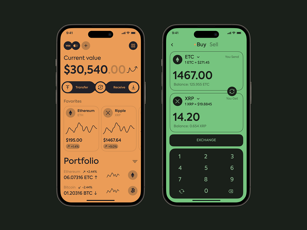
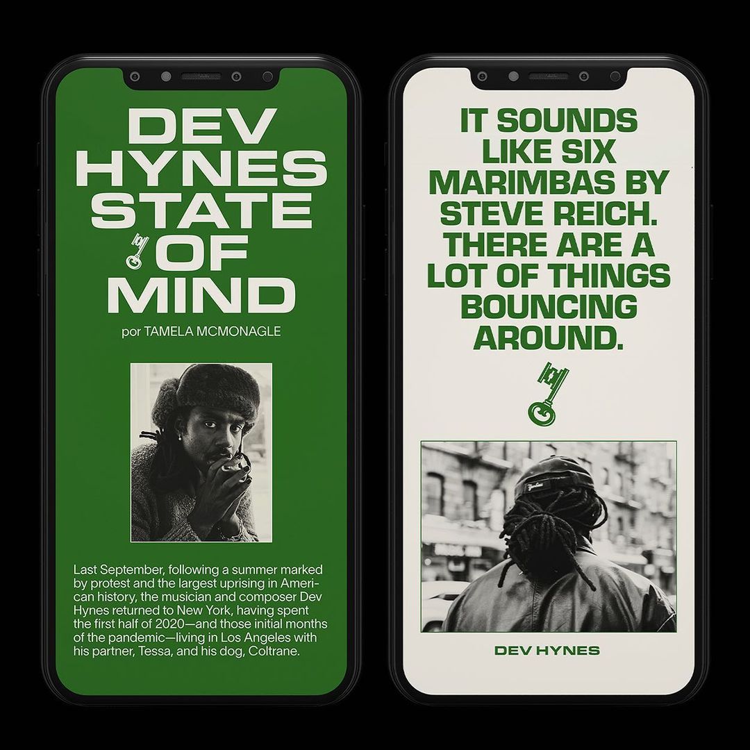
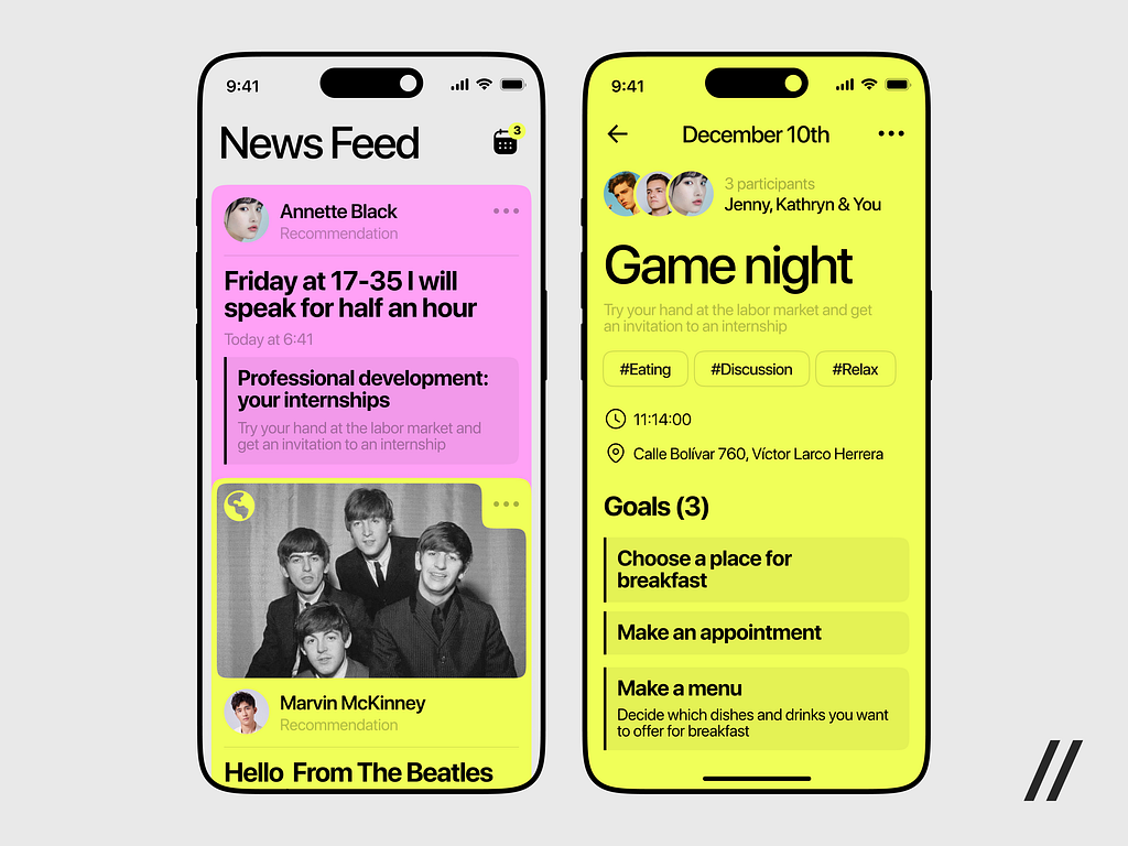
A good modern design brings together elements we like to look at. A great modern design makes you want to open their app just to look at it. It attracts users with their strong visual style. And then it’s a task for developers to make the functionality and flow on a par with it. For some reason apps with visuals that strong aren’t as common as you might think.
Conclusion
Don’t let pretty pictures fool you — first of all, you have to decide exactly what your client is for and how it’s supposed to work. Design comes after needs, not before. A client should work, and that’s the main part. But it’s a double win when a client works and it feels nice.
If you’re interested in more examples, visit Dribble, Behance or Pinterest, there is always something to get inspired by.
Don’t be shy. Create bold clients that will catch people’s eye. A logo can be poorly hand drawn, posts in a feed can be stylized as Macintosh windows, user profile can look like an inventory from a forgotten game — let your client be weird, funky, old school, wild, fancy. We’re here to have fun, aren’t we?